

Webflow Variables are one of the most exciting updates the product has had in a while and are going to be a huge improvement for Website scalability and ease of use. Since they are relatively new I’ve seen a lot of people posting on Twitter that they still aren’t really sure how best to use variables or what their purpose is. In this post I’ll explore two different approaches to using Webflow variables, talk about what kind of variables each method uses, and discuss the decision making process of when to use a variable vs a static value.
First off, what are variables?
Webflow variables allow you to create what are called CSS Custom Properties which are re-usable values that you can use throughout your website. Custom properties can support almost any text or number value but for now Webflow variables only supports sizes, colors, and font families. Recently Figma also released variables and these two features have a lot of cohesion when it comes to creating design systems — in this post I'm focussed on Webflow but there is a lot of overlap when it comes to options for usage, best practices and naming conventions.
The big advantage of variables is that it makes it much easier to make global changes to a site because you can reference these values throughout your design and easily change them in one place. You might be wondering, how is this any different from the old color swatches setup that Webflow used? Those were also global values that you could update in one place. Well… besides the added support for font families and sizes, variables have several other key benefits.
- You can create variables that reference other variables. This is a more advanced method that I’ll go into later but it is extremely powerful and deserves to be mentioned early on.
- You can update variables with Webflow interactions
- You can update variables with Custom CSS.
Okay so variables are a good thing, but how should I use them?
Great question, there are two main ways that you can approach using Webflow variables, the first one is a bit simpler and the second one, while more complex, has a lot of advantages at scale. I’ll talk through the differences and give some examples of what kind of variables might be included in each one.
Option 1 - Expanded Style Guide
I’m calling this method the expanded style guide and the basic concept is that you’re going to collect values that you re-use a lot throughout your design and create variables for them that you then reference in classes. Since Webflow variables are currently limited to color, size, and font families you’ll be limited to those kinds of values but as more are added these can expand.
When doing this you want to think through how valuable it will be to update these variables globally. Its also important to consider if that value is specific to one kind of component or is going to have to change on different breakpoints. For example, you probably don’t want to create a variable for the bottom padding on headings because this will change based on context and viewport so having a variable for the value won’t be that useful. In contrast, something like a consistent border radius that you use for card elements, and images throughout the site would have a lot of benefits to being a variable because you are referencing that value in a lot of different classes but want to keep them synced so that if you decide to change it down the road you can make that update in one place and it will happen everywhere.
Some good examples of variables like this are:
- Color / Black
- Color / Blue
- Border Radius / Primary
- Border Radius / Small
- Font Family / Satoshi
- Spacing / Page Padding
- Border Width / Main
*note, the slashes will help keep your variables organized by type so they are easier to manage.
If you’re confident in a bit of custom CSS you can also create variables for values that might change on different breakpoints and use a code embed to modify them with a media query. For example, your section padding sizes, or even your heading sizes. When doing this I would recommend creating a main variable that you reference throughout classes in your site. Then create variables for tablet, landscape, and portrait (in some cases you will just need one mobile variable). Then using CSS you can update the value of the main variable to match the other variables based on a media query.
This approach has several advantages. Firstly, you don’t need to edit any values in the custom CSS once this is set up. All your edits can be done in the variable panel and as long as you don’t rename your variables this will work great. Secondly, Webflow has mentioned they are working on a mode system for responsive variables. By setting it up like this you only reference the main variables (section-padding/large, section-padding/medium, etc) **variables throughout your classes. This means that when modes are launched you can just add the values of the responsive variables to the main one, then delete the responsive variables and CSS and everything will work the same without messing up anything on your site.
Option 2 - Design System
If you’re confident in the ideas and setup in option 1 I’d recommend trying to create a design system. A design system is going to involve more levels of variables and will start having variables that reference each other. Often this is done by having several layers of variables.
- Option Variables
- Semantic Variables
- Component Variables (optional)
The first layer of variables are going to be your option values. A lot of these will line up with the system above: color swatches, border radiuses etc. Once those are created you create what is called a semantic layer of variables. These are variables that are going to form contextual relationships around the types of raw values. And finally, sometimes it can be helpful to include a component layer of variables that reference the semantic layer. In my opinion these aren’t really necessary in Webflow because you have the classes that are then referencing tokens and will be often named based on their component, but that also depends on the size of your site, so if you find these helpful go for it.
The easiest way to explain how these work is to provide some examples:
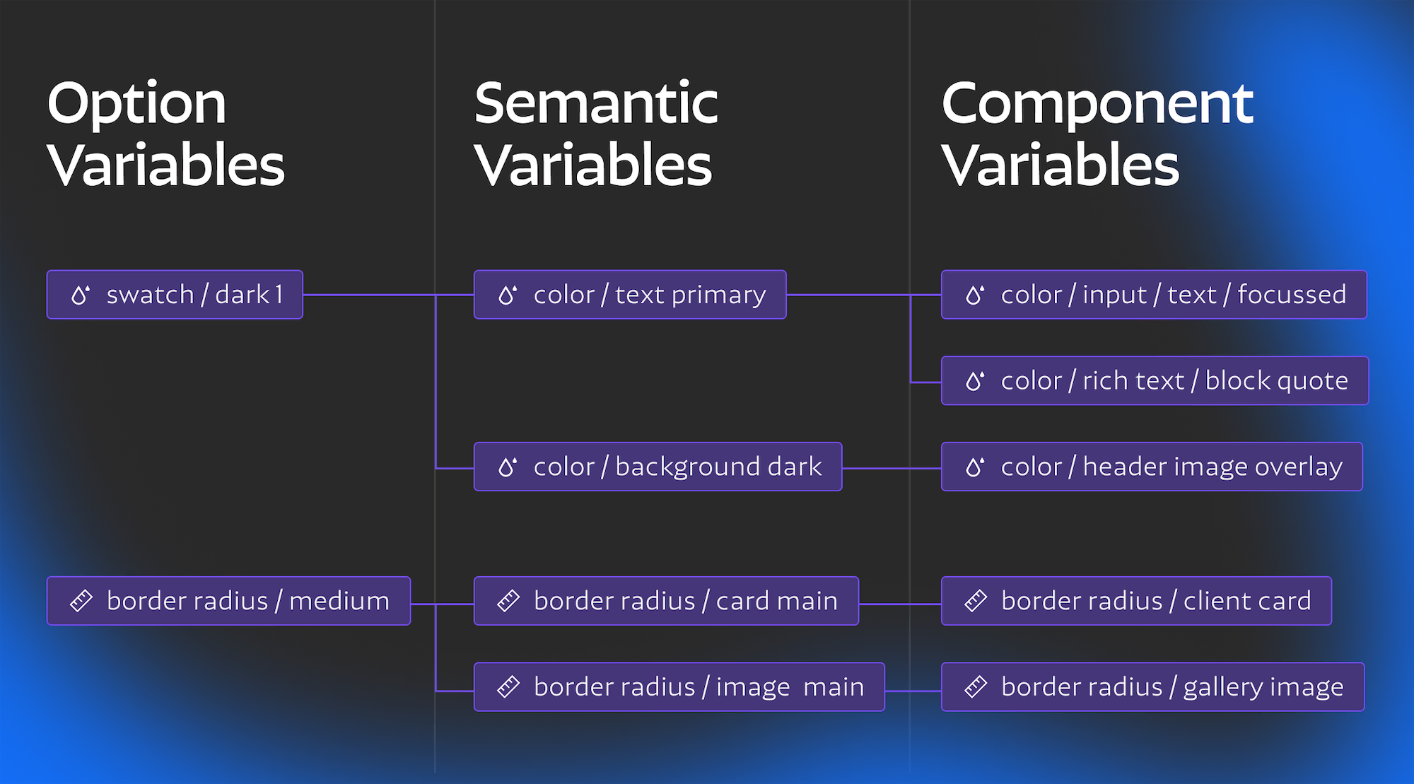
text color / primary - This is going to be the main text color on the page, you can also have a secondary text color or even an accent text color.
border radius / image main - This would be the most common image border radius used, allowing you to keep it separate from other border radius values (like cards) allowing you to change just one of them if you wanted, or also keep them referencing the same option value.
border color / primary - This is going to be the most common border color for ui elements and could be referenced in tags, form fields, and more.
The reason for having these different layers of variables is that it gives you more granular control over how design styles are inherited. Being able to update your secondary text color to a different swatch without also changing that color everywhere else it is referenced is incredibly powerful and can hugely speed up making edits to your site. An important thing to note with this type of system is that you only want to be referencing the most specific layer of variables in your classes. For example, if you have a text color / primary variable but are referencing swatch / dark 1 as your text color in the body tag then updating the text color variable isn't going to make the changes you want. Like I mentioned above I tend to just use two layers of variables (option and semantic) since class names are often based on components. In this case you almost always want to reference the semantic variables in your classes, leaving the option variables as a layer for controlling core values without actually needing to use them in classes. This can be a tricky differentiation to make when it comes to variable naming, when possible you want to keep it clear which variables are option values and which ones are semantic variables — more on this below.
Naming Variables
How you name variables is very important but also somewhat subjective. There isn’t one right answer but there are some helpful strategies and options to consider.
Core Concepts
Consistency is key when it comes to variable naming, you want someone who is using your design system to easily be able to find the right value when adding variables in the style panel or choosing between variable options. This means that all related variables should have the same option name, often this will mean the the first part of the name is in the same folder eg border radius /, spacing /, font size/, etc. If you are using a design system with option and semantic layers it may be worth considering some way to separate these layers in the name. For example an option layer variable could be border radius / values / large By adding in the value folder this keeps the option variables visually separate from the ones you are referencing in your styles. You can also start all variables within a certain layer with a specific keyword (eg all option variables start with base/ or something like that).
Another important strategy is to try and keep things in order (either from small to large or vice versa, pick one direction and stick with it). While I’m sure Webflow will allow you to re-order variables eventually right now they are going to be within the folder you name them in (folders can be added as a / within the name). Folders are organized alphabetically but each variable within a folder is organize chronologically meaning that when you make a new variable it will always go to the bottom. This means that it makes the most sense to try and create all the variables you will need at the beginning of a project and create them in order. If you need to add another variable later its not the end of the world but its best to plan ahead whenever possible.
To capitalize or not? This is mostly up to personal preference. I would probably follow whatever your class naming convention is with this decision. I tend to not capitalize since that is closer to what the css variable name will be, but once again, just pick one style and stay consistent.
Most variables will include a category and variant. Depending on how complex your design system is you may also include things like states, responsive sizes etc. When naming variants there are a bunch of different patterns to choose from, each has their pros and cons.
Number ( 0, 1, 2 etc.) - This is great because you can add values on either end or in between (like 0.5), what is challenging about this method is that there is no clear default value and depending on the type of variable it can be hard to know which one to choose when in designer. It can also be a challenge to decide where to start the numbers from 0? 10? 100? I find these to work best when they directly reference the value of the variable. Like in a responsive sizing system (check out my cloneable for an example). Some systems can also use this for color variations (often those are from 100-900 like in the Material Design System, or 0-10 like in the Ant Design System).
T Shirt sizes (sm, md, lg etc) - These can be great because its easy to add more options to either end. At a certain point though its best to switch to a numeric system because xxxxl is not very legible or easily understandable. Often this naming style can be good for typography because medium is understood to be a default value and there are clear variations in size from there.
Precedence (primary, secondary, etc) - This is best when you have under 3-4 values, having to use words like quinary can get confusing pretty fast. It works good for things like buttons, or values that you don’t have many variations of. These can also be combined with other descriptors to better explain roles for specific purposes eg( text color / primary, text color / accent ).
Functional (success, warning, etc) - This works best for things like states or types of colors (hover states, interaction states, state based colors etc.) These need to be both descriptive and concise.
Description (Hero Text, Gallery Radius) - Often a description will be a part of the name but its best to include one of the previous methods to give a sense of precedence or order. If you're only using a description this works best for one off variables or ones that use interactions. I’d actually recommend having a whole Interactions folder of variable names since those are going to be over-written and will most likely have a very narrow purpose.
Media Query - There are two main ways to name variables that are for specific breakpoints. The first is written out (Desktop, Tablet, Landscape, Portrait) the second is (lg, md, sm, xs). I prefer the second because it is shorter but they are less clear so it will be up to you which is more important.
Color Approaches
Color is one of the more complex systems to deal with when it comes to variables. More complex color systems provide a lot more power when it comes to theme switching or dynamically recoloring sections and elements, but at the cost of flexibility. From what I’ve seen there are three main options for approaching color systems each has its own advantages and disadvantages.
Color Swatches
This is the most basic method, it basically involves using colors like you would a color swatch in the old webflow system or Figma style. Reference it in classes and if you want to update the shade you can do that globally, pretty straightforward.
Simple semantic color system
In this method you create your color swatch variables as normal and then you can create a layer of semantic variables that categorize color by usage. Most often this will break out variables for text, backgrounds, and borders (and occasionally, you may want outlines, text stroke, and buttons to be separate). This gives you much more granular control over how colors are updated if your color palette changes. Maybe you introduced a new color into your system and you only want to use it for accent text, with a system like this it wouldn’t be complicated to make that change. The difficult part here is deciding how you deal with design anomalies. For example, if your whole website is in a light theme but you have occasional sections with dark photo backgrounds you need to create unique variables for those overlays and text colors.
Color Modes
The most complex (and most powerful) method is to create a system with color themes. In this system you can completely recolor sections or pages and all of the elements within them with a simple class or attribute change. This allows for quickly designing sites that have alternating color themes in each section or even creating a light and dark mode toggle switch. The tricky part here is it involve a lot more CSS to set up and is also going to be a bit more rigid, if you don’t use the right variables to apply to an element it could appear right in one mode but break if you try to switch modes later on. This kind of system takes a lot more planning but can definitely pay off if you’re willing to invest in it. To learn more about color modes I’d definitely recommend checking out Timothy Rick’s tutorial on it focussed on his Lumos framework. Lumos is going to be updated with a v2 in a month or two when Webflow launches Custom CSS properties and I’m sure it’s going to include a lot of really cool tricks on how to create color modes using Webflow variables.
Final thoughts
Hopefully all of those tips and naming ideas will help you as you start to create projects with more complex design systems. There are already a lot of good resources out there to check out. Most design systems out there aren’t specific to Webflow, and may be more complex than you need, but reading through their documentation will help you understand the options and best practices better.
Additional Resources
- This blog post talks about the importance of design tokens and how they can be used with figma variables
- This article goes a bit more in depth about variable naming conventions and how they can be approached from a development perspective
- This youtube video by Tokens Studio is a super in depth explanation of different types of design tokens. It goes more in depth than most webflow projects will need because he is also considering facilitating different brands, and media types but its definitely worth a watch if you're invested in learning about design tokens and variables.
I’ve also put together a cloneable that brings together elements of the Client-First and Lumos frameworks while utilizing variables. I know both of the frameworks are going to get updated to use variables eventually but I had a few projects start this week and didn’t want to wait for the official releases so I thought I’d create a starter kit that takes advantage of the full power of variables. This won't have every variable you need but it includes most of the core ones that every project will use and you can expand and customize it from there.
What’s a Rich Text element?
heading 3
heading 4
heading 5
The rich text element allows you to create and format headings, paragraphs, blockquotes, images, and video all in one place instead of having to add and format them individually. Just double-click and easily create content.
- aslkdjflaskjdf;laksjd;flkjasd
- sld;kfj;laskdjf
- laskdjflaskjdf;lajksdf
Static and dynamic content editing
A rich text element can be used with static or dynamic content. For static content, just drop it into any page and begin editing. For dynamic content, add a rich text field to any collection and then connect a rich text element to that field in the settings panel. Voila!
How to customize formatting for each rich text
Headings, paragraphs, blockquotes, figures, images, and figure captions can all be styled after a class is added to the rich text element using the "When inside of" nested selector system.


