

One of Webflow’s strongpoints is that you don’t need to know CSS to make a beautiful website. That being said Webflow doesn’t give you access to every CSS property, and while they are constantly expanding things (with additions like blending modes and backdrop filters which you used to only be able to add through custom CSS) some properties aren’t currently accessible within the designer.
These are beginner friendly
I know that custom code can be intimidating, especially when you’re in the beginning stages of learning webflow, but I promise these code snippets are really easy to use and will be a big help. Before I get into the code snippets I'm going to cover a couple of important notes on how to use custom code in Webflow.
Where do I put these code snippets?
Within webflow there are several options of where you can put custom code and it can be confusing to know which one to use since it depends somewhat on the type of code. What I would recommend for CSS is using a custom embed on your page that you turn into a symbol — this has several advantages. Firstly when it is an embed on the page you can actually see the changes in the designer whereas if you put the code in the site or page settings you won’t be able to see the results until you publish the site. Additionally, it is faster to make edits to code that is already on the page in the designer rather than having to go to the site settings to make updates. To do this just drag an embed element onto the page and paste the code into it (don’t forget to use style tags)
From there you can save and close, right click on the element and save it as a symbol (I’d call it something like global styles). Now you can put that symbol on every page (I’d put it at the top next to the nav bar) and that way the code you add will be consistent across your entire site, have visible effects in the designer, and be easy to update as needed.
If you’re brand new to custom code in webflow here’s an important thing to know
When using CSS in Webflow one important thing to note is that Webflow changes the names of your classes when you publish the site if you use capitalization or spaces — so a class named Hero Image in the designer becomes hero-image
Along with this when you’re targeting CSS classes it is important to add a dot before the class name like in the above example.
One last helpful tip
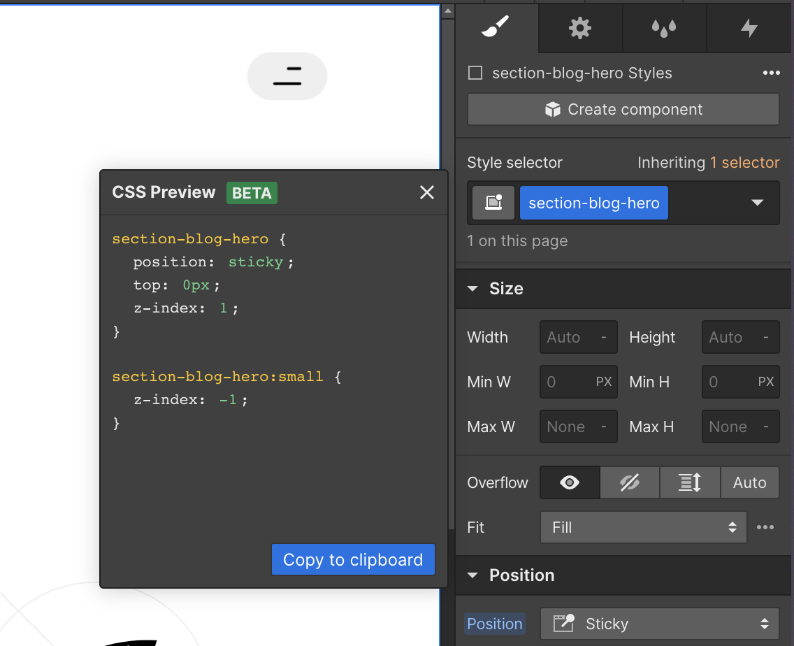
Sometimes you’ll run into a scenario where it makes sense to add some custom code but you might not know know exactly what properties to use (For example, make every other item a reverse flexbox layout. In these instances you can just style an element how you want directly in webflow and then use the CSS Preview tool (which is in the top left or bottom left menus in designer) to copy the styles as a starting point, paste them in your Global styles embed and modify them as needed.
Okay, now on to the actual code snippets…
1. Make an element not clickable with pointer-events
There are times when you really need an element to not be clickable — maybe it's a gradient overlay over a background video, or an element that is making a hover animation glitch out, or you want to create a custom cursor. In these situations adding this code snippet can prevent these elements from being affected by click or hover events.
Just replace .class-name with the name of the class of your element. If you need to do this to multiple classes just use a comma separated list before the pointer events code eg: .class-1, .class-2
One important thing to note is that this will also affect all of the children elements inside of the class you set to pointer-events: none. If there is an element inside of the class you’re selecting that you still need to be clickable you can solve this by selecting that class and setting it to pointer-events: auto.
2. Create vertical text layouts
You can use the below code to make your text vertical which can provide some more interesting options for layouts and integrations. Note that there are other ways to make text vertical by only rotating it with transforms but that can often be more difficult to position and makes it harder to use Webflow interactions since they will overwrite any transforms applied to the text if you try to modify its position at all. *Note: you may need to apply a z rotation transform of 180 if you want the text to be flipped.
As an example of how this can be used in a design, I built the side navigation using this code when I developed Rachel Young’s portfolio
3. Hide extra lines of text for design consistency with clamp
This can be really helpful if you want to have design consistency in card or blog elements. By adding this code in it will cut off extra text that goes beyond 2 (or 3) lines and add an ellipses so that the design won’t get too messy. This can be especially helpful in CMS based blogs where you can’t see how your text will look in the layout or if you’re handing the site off to a client and want to make sure your design stays intact.
4. Change the style of highlighted text for extra design flair
This is a really simple detail that can help your site stand out by having a more consistent color scheme, it’s also incredibly easy to do. Just change the color style to update the color of the text and the background style to update the color of the background. If you want to add opacity it can be helpful to format the color as an RGBA value eg: rgba(0, 0, 0, 0.2). You might have noticed that I used this code on my website to make the selection style light gray instead of the default color.
5. Make an element inherit its color from a parent
This can be really helpful to override some of Webflow’s default styling. For example if you want a link's color to be dependent on what class you give it and not have to mess with the all links tag. You can also set the background color to inherit which can be helpful if you’re trying to implement a light and dark mode on your site.
6.Change autocomplete styles in forms
This code allows you to change how your form input fields look when a user autofills the information. I don’t know about you but I always use autocomplete to fill out my name, email, and address, and often the browser default style does not work with the color palette of the design. Paying attention to small details like this can make a big difference in the user experience because of the seamless design consistency on your site.
*Note: Snippet 6 used to be add a text outline but since Webflow released that ability natively I update the post to include something a bit more useful that still can’t be done within the designer.
7. Set an aspect ratio on an image (or a div)
Sometimes its really helpful to set an aspect ratio for images so that layouts are more consistent regardless of the image chosen. All you need to do is add the below css and then define a specific width like 100% to the element you want. Its important to note that this aspect ratio can be over-written if you set both and explicit width and height or are using grid or flexbox in a way that stretches the image dimensions, but in most cases I find the aspect ratio property to be simple and dependable.
You may have seen or used the top-padding trick before to set an aspect ratio and while that does work it can be a bit more annoying to set up because you need 2-3 layers of divs in order to structure it correctly and it can be easy to forget what percent top padding you need for the correct aspect ratio whereas the aspect-ratio css property is formatted really intuitively.
8. Style individual CMS items with nth:child
Another really useful ability is being able to target specific items within a CMS collection and give them unique styles. This is one of the more advanced options in this list because there are so many possibilities with it and so the options depend a bit more on how much other CSS you know and how much you’re willing to google. Basically this allows you to select items based on their order in a list (in my experience this is most useful for collection lists but you can try out other types of lists too). You can either select one item by just putting a number in the parentheses eg (4), or a series of items (like all even items, or every third item starting from 6). When you're selecting a repeating set of items it will be using the format of (xn+y), where x is how often to repeat the selection, and y is where to start counting from. So (3n+1) will select every third item starting with 1, or (5n+4) will select every fifth item starting with four.
Once you have those items selected you can do whatever you’d like to style them. Some easy options would be to change the text color or the background color but you could really add any type of style here. If you don’t know how to change a property you can google something like “CSS flexbox reverse layout” and usually find a good explanation with the correct syntax to use. MDN and W3 schools are great references that usually explain things pretty clearly. You can also use the CSS Preview trick I mentioned above to style an item how you want and then copy and paste those styles within an :nth-child selector.
Want to take it a step further?
You can use the following naming convention to select elements inside the CMS item for even more flexibility, you might want to change the heading size or button color and combine this with the nth:child code above to really customize things. I’ve put a couple of sample ideas below with comments but at this point you’ll definitely want to customize it to fit your project.
That’s it, I hope that was helpful
If you have any questions feel free to reach out. I hope this helped you feel a bit more confident in your understanding of CSS and how it can go hand in hand with work in the Webflow designer.
What’s a Rich Text element?
heading 3
heading 4
heading 5
The rich text element allows you to create and format headings, paragraphs, blockquotes, images, and video all in one place instead of having to add and format them individually. Just double-click and easily create content.
- aslkdjflaskjdf;laksjd;flkjasd
- sld;kfj;laskdjf
- laskdjflaskjdf;lajksdf
Static and dynamic content editing
A rich text element can be used with static or dynamic content. For static content, just drop it into any page and begin editing. For dynamic content, add a rich text field to any collection and then connect a rich text element to that field in the settings panel. Voila!
How to customize formatting for each rich text
Headings, paragraphs, blockquotes, figures, images, and figure captions can all be styled after a class is added to the rich text element using the "When inside of" nested selector system.


